-

Victoria Hypermarket
PROJECT Victoria Hypermarket TYPE retail / commercial LOCATION Magway, Myanmar OWNER Super One International Co., Ltd. SITE AREA 3.95 acre USED AREA 1,691.6 sq.m. STATUS construction in progress -

Victoria Hypermarket is a retail based in Myanmar, owned by SUPER ONE International Company Limited. There are many branches spread throughout the country, this Victoria Hypermarket @ Magway is one of them which will be another new branch under Victoria retail.
Since Magway is a town of school and college, the primary target of this hypermart is students. There are two floors which separating the two main functions by levels, downstairs is a supermarket while upstairs is for apparels, stationery, and electronics.
An interior space for the second floor is like a mezzanine which has a middle court open space down to below. This allows connectivity of each area between upstairs and downstairs, so customers can see activities at the other level.
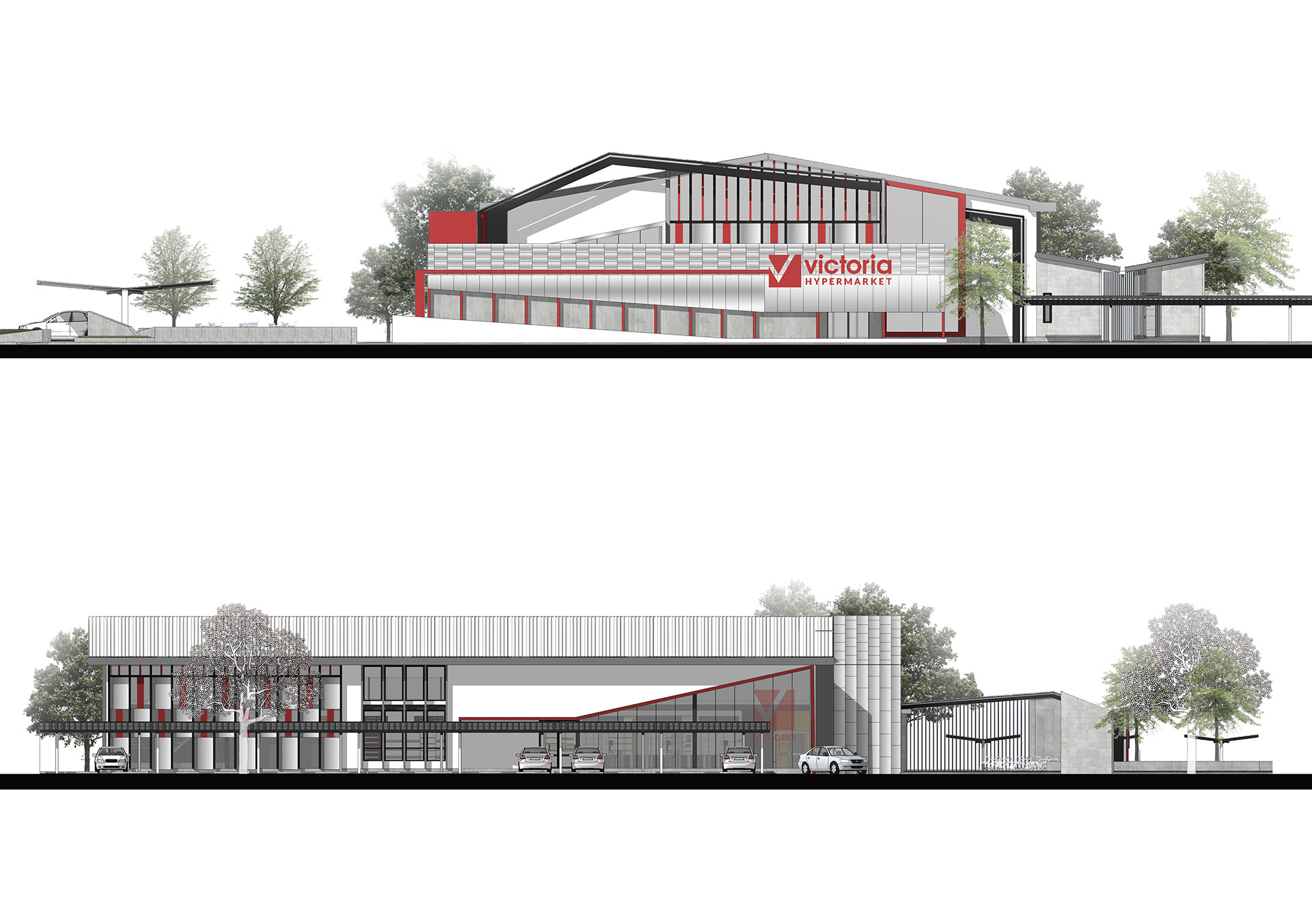
An exterior façade, the colour of Victoria’s logo which is red colour is integrated into the design, along with clear glass wall and black steel structure. Moreover, there are pedestrian route goes directly to the main building which also has a triangle landscape event area beside. -

-


| PROJECT | Victoria Hypermarket |
| TYPE | retail / commercial |
| LOCATION | Magway, Myanmar |
| OWNER | Super One International Co., Ltd. |
| SITE AREA | 3.95 acre |
| USED AREA | 1,691.6 sq.m. |
| STATUS | construction in progress |
Victoria Hypermarket is a retail based in Myanmar, owned by SUPER ONE International Company Limited. There are many branches spread throughout the country, this Victoria Hypermarket @ Magway is one of them which will be another new branch under Victoria retail.
Since Magway is a town of school and college, the primary target of this hypermart is students. There are two floors which separating the two main functions by levels, downstairs is a supermarket while upstairs is for apparels, stationery, and electronics.
An interior space for the second floor is like a mezzanine which has a middle court open space down to below. This allows connectivity of each area between upstairs and downstairs, so customers can see activities at the other level.
An exterior façade, the colour of Victoria’s logo which is red colour is integrated into the design, along with clear glass wall and black steel structure. Moreover, there are pedestrian route goes directly to the main building which also has a triangle landscape event area beside.
